ClioSport.net
-
When you purchase through links on our site, we may earn an affiliate commission. Read more here.
You are using an out of date browser. It may not display this or other websites correctly.
You should upgrade or use an alternative browser.
You should upgrade or use an alternative browser.
Max5 Racing Blog (Mazda MX-5)
- Thread starter AdamR
- Start date
Mk1 MX-5 (x3), Westy
Had a good day at Mallory on Sunday just gone! Qualifying was rain-affected, the heavens opened towards the end which saw a couple of cars diving for the pits having done their quickest laps. Mine was quick enough for 3rd in class. However, I decided to stay out and play around with unconventional lines, which seemed to help in the race...
Race 1 - lined up alongside Tom and behind Chris, I was hoping for at least a half decent start otherwise my visibility would be seriously compromised! We were the first race after lunch and it had been raining for an hour solid, so the track was soaked... Luckily I got away well, making a couple of places and then a couple more when Jeremy and Clive fired off to the left before Gerrards (both of them via Jon's bonnet!).
From there I managed to get inside Chris, somehow find some grip and keep a reasonable (class) lead, pushing some of the Mk3 guys until I went straight on at the hairpin and needed a few seconds on the grass to turn around :lol: After this I spent most of the race by myself slip sliding around, picking off backmarkers every now and again. It appeared that a lot of very wet trackdays over winter hadpaid off, I felt much more comfortable letting the car 'loose' and controlling slides even at some fairly high speeds.
Somehow by the end of the race I'd lapped up to and including 4th in our class - but Amy was closing in and would have caught me given a couple more laps... Still, it felt like a 'genuine' win as I'd had to work pretty hard, not like at Snetterton last year which was a bit hollow.
'Highlights' vid from Race 1 is here:
It was pretty windy all day so by Race 2 the track was mostly dry, with a few damp bits offline. Once again I made a pretty decent start (for me!) and managed to keep Amy at bay - from there I managed to stick to the back of the Mk3s pretty well (apart from the straight coming out of the hairpin), and had a chance at passing Ian up the inside of the hairpin.
Like last year on Paul, I gave it a go but it didn't quite go to plan... I tagged Ian's rear wheel with my front wing and bumper (sorry!) in a fairly hard hit. Luckily it didn't put either of us out of the race, but Ian did say he had a vibration for the remaining laps Sorry again...
After that the blue flags were, erm, a little less sparing than they should have been, which made it impossible for me to catch Ian again, but I still had fun making some passes on some of the other Mk1s. This time I managed to lap up to and including 3rd while Tom was snoozing following a yellow flag area
The race was stopped a bit early due to a crash involving Simon and the barriers, meaning an ambulance was sat on the outside of Gerrards for a couple of laps... A good decision I think. Pleased to report he had a check up at the local hospital and was discharged the same evening. Hope to see you at Anglesey!
The usual post- race chat in the scrutineering bay made me reliase I'd not changed any of the car setup after the wet race, oops! It obviously worked though.
Here's Race 2's vid:
So, overall, was pretty happy with how the car felt and how the day had gone. Looking at the data and times by Rob last year (mid 56s!) though I still have plenty of work to do...!
It shows I wasn't trailing the brakes in anywhere near enough, leaving time at each of the braking zones (and thus I could have held onto the straight speed a bit longer too). Mallory isn't the sort of place you want to fire it off like I did at Donington though, so it was probably a safe bet holding back a touch, especially given the dampness off line...
The three laps highlighted are pretty consistent, but it does show if I'd have put together my best sectors I'd have been down at 57.1 rather than 57.9. Slipstreaming seems to pay a significant part in the fastest laps (video of them will be added later) with an extra couple of mph being gained at the ends of the straights - good to know for future
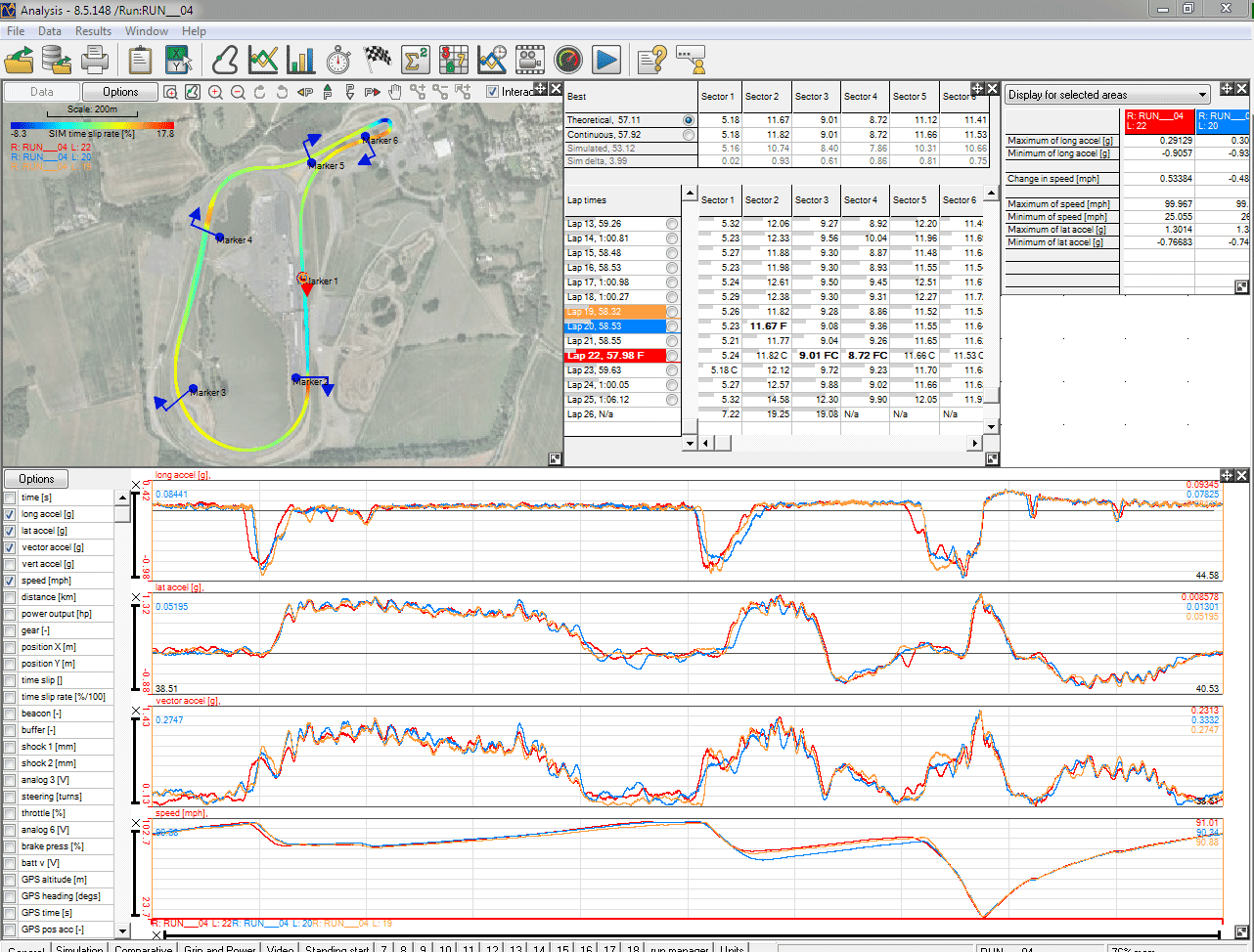
I'll bob up a video of 4 laps (Lap 19-22 inclusive on the data) with data overlay later when it's finished uploading - at your request Alan!
Cheers,
Adam
Race 1 - lined up alongside Tom and behind Chris, I was hoping for at least a half decent start otherwise my visibility would be seriously compromised! We were the first race after lunch and it had been raining for an hour solid, so the track was soaked... Luckily I got away well, making a couple of places and then a couple more when Jeremy and Clive fired off to the left before Gerrards (both of them via Jon's bonnet!).
From there I managed to get inside Chris, somehow find some grip and keep a reasonable (class) lead, pushing some of the Mk3 guys until I went straight on at the hairpin and needed a few seconds on the grass to turn around :lol: After this I spent most of the race by myself slip sliding around, picking off backmarkers every now and again. It appeared that a lot of very wet trackdays over winter hadpaid off, I felt much more comfortable letting the car 'loose' and controlling slides even at some fairly high speeds.
Somehow by the end of the race I'd lapped up to and including 4th in our class - but Amy was closing in and would have caught me given a couple more laps... Still, it felt like a 'genuine' win as I'd had to work pretty hard, not like at Snetterton last year which was a bit hollow.
'Highlights' vid from Race 1 is here:
It was pretty windy all day so by Race 2 the track was mostly dry, with a few damp bits offline. Once again I made a pretty decent start (for me!) and managed to keep Amy at bay - from there I managed to stick to the back of the Mk3s pretty well (apart from the straight coming out of the hairpin), and had a chance at passing Ian up the inside of the hairpin.
Like last year on Paul, I gave it a go but it didn't quite go to plan... I tagged Ian's rear wheel with my front wing and bumper (sorry!) in a fairly hard hit. Luckily it didn't put either of us out of the race, but Ian did say he had a vibration for the remaining laps
After that the blue flags were, erm, a little less sparing than they should have been, which made it impossible for me to catch Ian again, but I still had fun making some passes on some of the other Mk1s. This time I managed to lap up to and including 3rd while Tom was snoozing following a yellow flag area
The race was stopped a bit early due to a crash involving Simon and the barriers, meaning an ambulance was sat on the outside of Gerrards for a couple of laps... A good decision I think. Pleased to report he had a check up at the local hospital and was discharged the same evening. Hope to see you at Anglesey!
The usual post- race chat in the scrutineering bay made me reliase I'd not changed any of the car setup after the wet race, oops! It obviously worked though.
Here's Race 2's vid:
So, overall, was pretty happy with how the car felt and how the day had gone. Looking at the data and times by Rob last year (mid 56s!) though I still have plenty of work to do...!
It shows I wasn't trailing the brakes in anywhere near enough, leaving time at each of the braking zones (and thus I could have held onto the straight speed a bit longer too). Mallory isn't the sort of place you want to fire it off like I did at Donington though, so it was probably a safe bet holding back a touch, especially given the dampness off line...
The three laps highlighted are pretty consistent, but it does show if I'd have put together my best sectors I'd have been down at 57.1 rather than 57.9. Slipstreaming seems to pay a significant part in the fastest laps (video of them will be added later) with an extra couple of mph being gained at the ends of the straights - good to know for future
I'll bob up a video of 4 laps (Lap 19-22 inclusive on the data) with data overlay later when it's finished uploading - at your request Alan!
Cheers,
Adam
Last edited by a moderator:
Mk1 MX-5 (x3), Westy
And here's the laps with data...
https://www.youtube.com/watch?v=PJ6YojoMWx8&feature=c4-overview&list=UUr75zTeOutCbIEpNNog0Fyg
https://www.youtube.com/watch?v=PJ6YojoMWx8&feature=c4-overview&list=UUr75zTeOutCbIEpNNog0Fyg
Aaah good ol Tartybikes. Those were the days.
Mk1 MX-5 (x3), Westy
Bit of a bump, but a vid from the races this weekend... action throughout including quite a few slidey bits.
Highlights are at:
First few mins - the start and getting mugged by nearly everyone on the first lap!
1:45 - went for a pass around the outside but got squeezed out at the last second
2:00 - slidey slidey, followed by getting passed by Jeremy and Duncan, then we're pretty close for the chicane...
3:05 - made up a load of ground at Church but couldn't get through
5:10 - same again
6:00 - getting close with Jeremy
7:30 - Simon gets it sideways coming out of the chicane, made a pass up the inside
8:05 - snatched 2nd too forcefully and got it pretty sideways
8:30 - made up a lot of ground through Goodwood and Church, made the pass, but c**ked it up!
9:45 - dicing with Jeremy again
11:20 - good run through Seagrave, made the pass as Liam trundles off with head gasket failure
14:20 - chasing Duncan, getting close through Church
15:10 - huge slide, lost a lot of time
16:45 - went for the pass and c**ked it up...
17:40 - starting to rain now, another good run through Church
18:05 - huge train of cars through the chicane
19:10 - more rain and a good run through Goodwood
19:50 - the Rodders train gets ever closer!
20:15 - side by side with Matt
20:55 - good run out of Goodwood to make the pass... just. Then right up behind Amy at Church.
21:35 - tried around the outside but didn't make it stick
21:45 - little bit of slidey action for the crowd on the last lap
2nd vid uploading now too
Last edited by a moderator:
Mk1 MX-5 (x3), Westy
Race 2:
Start - got away ok, then lost the back end through Goodwood (1:00), but managed to bring the gap back down at Church (1:20)
1:40 - sent it up the middle of a pack of cars and squeezed ahead at the chicane
5:30 - caught Jeremy up
5:50 - up the inside at Goodwood
6:25 - comes back past up to the chicane, Amy right on my tail again now, for quite a long time...
7:50 - hit the limiter through Church, huge sideways pant-filling moment - scariest moment I've ever had on track!
8:15 - Amy has a look up the inside but just keep her back
10:20 - Jonathan spun at the complex, managed to get past safely
11:10 - sideways at Church again
11:20 - tried to work a pass on Jeremy but stuffed it up, ran wide, let Amy back through
11:45 - was pretty sure I left Matt plenty of room there......
12:05 - wrong gear selection cost me a big gap to Amy!
12:45 - lined up a pass by carrying speed through Church, but it wasn't to be...
13:05 - tried around the outside again but no joy
14:10 - carried speed through Goodwood and made a pass up the inside at Church
14:40 - Simon comes steaming through
16:15 - sent it up the inside from way back
16:35 - but to no avail
19:15 - sideways through Church again
19:45 - grabbed 5th instead of 3rd, arse!
21:30 - crossed the line, still very close to all the other cars
Last edited by a moderator:
Mk1 MX-5 (x3), Westy
Yeah, I was a bit. First race though, want to keep the car in one piece. Was a bit more 'forceful' in race 2 
The Mk3s are about 150kg heavier I think, but probably have another 40bhp. They're pretty much the same pace out of the corners but as you can see they really pull away when you're up at 90+mph.
Some of the Mk1s seem to pull away from me even when I'm in their slipstream too, hoping that will get policed soon because if gets very tiresome nearly rear-ending them in half the corners but not being able to get near them at the end of the straights!
It did look a bit slippy to commit but that green car was a bit erratic I would have just had him out the way or off lol.
They get a better run out the chicane, it kerbs your overtaking chances until the hairpin if clean laps are driven by both.
Whats the engine regs, no blue printing but several engines can be split and best parts selected? Free exhaust, free induction? You did post the regs but to save me looking through.
Also what do you cut your RS-R's down to for the dry?
Race 2 was good, mk1's party piece is definitely there brakes, nice overtake into the chicane.
Mk1 MX-5 (x3), Westy
Haha. We don't do any of that - never seen any of our registered drivers make deliberate contact, and we all want it to stay that way 
Yeah exactly, they just backed me up so I had to lift out and it killed me on exit... with hindsight I should have left a gap on the way into the chicane, closed up through it and then tried to get my nose down the inside on the start / finish straight. It's still a steep learning curve!
Engine - free head skim, free exhaust, but everything else standard. We don't bother with splitting engines and stuff, the fastest guy on our grid last year just had a £150 eBay engine with a head skim and a fresh set of plugs - we have a 'gentlemans agreement' on maximum power and if you have more it sticks out like a sore thumb (hence my above comment about the guest drivers and slipstreaming). Nobody wants to just throw money at their car to make it less reliable and we want to keep it that way.
Nobody shaves tyres and most people only have one set of wheels, a few of us have 'wets' (less worn) and 'drys' (more worn) but that's it. Again, we don't want to throw money away by shaving down good tyres!
Cheers man, I should have done that move more I reckon... next time.
Nothing too harsh, just a reminder your coming through.
Thats good with the engines, it is a proper entry level class. Was there suspicions of the guest drivers sportsmanship?
I had heard the mx5's were shaving their tyres for the dry because as stupid as it sounds they were lasting longer with the less block movement and giving more consistent times, might be the other championship.
I guess you suffer from edge wear on them too, it seem's it's just a trait of them?
Mk1 MX-5 (x3), Westy
Yeah it keeps it cheap and reliable! (We can do a full season on £5k easily, including all fuel, food, spares, race entries, etc.) Pretty sure they had more power (which is fine in the other series) as I couldn't catch them while slipstreaming and they kept a spare head gasket in the van (no reason for that other than a high compression ratio!).
Aah, the other series shaves their tyres, yes, but I they are on Hankooks (K110s I think), so they aren't an R compound.
Yeah the edges on the Federals wear pretty quickly but doesn't cause any issues.
Aah, the other series shaves their tyres, yes, but I they are on Hankooks (K110s I think), so they aren't an R compound.
Yeah the edges on the Federals wear pretty quickly but doesn't cause any issues.
182cup & 172 racecar
I like it. 
Mk1 MX-5 (x3), Westy
Well, this hasn't been updated for a while, but here's a short run down of the rest of last season and the winter...
- Did most of the rounds apart from Rockingham, kept oil in the engine this time and didn't have any DNFs.
- Ended up 2nd overall in the championship, but only really because some of the super fast guys didn't enter all the rounds!
- Decided to rebuild my engine as it was tired, but didn't use a new oil pump and the bottom end died on a track day...
- Rebuilt it again and it runs fine now.
- Had geo sorted out, raised the ride height a bit and generally tweaked the car.
- Just raced at Donington this weekend gone and came away with two 2nds and two fastest laps after some really close battles with last year's overall champion Amy, which wasn't bad but could / should have been better!
Videos from the rest of the 2013 season can be found here: http://www.youtube.com/results?search_sort=video_date_uploaded&search_query=thetart20+max5
Donington was the first round last year and once again we had a completely full grid of 30 cars. Some changeable weather conditions meant everyone was guessing setups before qualifying, but I went with something in the middle and didn't think it would rain any further. The track was a reasonably dry but inconsistent in terms of grip, so thought I'd take it steady at the start to ensure I didn't fire in in the gravel and get the mandatory 3 laps in... However on lap 3 it started lashing it down with hail! Unfortunately a few others had considered rain and had gone out hard at the start, meaning my grid position was 6th in class and 15th overall.
After checking the times when we'd got back I was gutted - only 0.7s slower in the wet than I'd been in the dry, and if all of quali had been wet I'd have ended up 4th overall! http://tsl-timing.com/barc/2014/141221max.pdf
Not worry, it just meant I would need to get stuck in for the race and have a good first couple of laps - something I wanted to work on from last year.
I did get a decent start and made a place or two into the first corner, then passed a couple of Mk1s and got on the tail of Amy. We had a huge battle for the rest of the race (video soon) which I just managed to come out on top of! Was pretty chuffed with the result, but then standing around for ages in parc ferme made me a little nervous... All the top 3 Mk3s were checked for geo, Rob who won Mk1 class got checked for geo as well, then I got weighed AND checked for geo! It was all within the regs though and I was 10kg over the weight limit, meaning I could afford to run a bit less fuel for race 2...
Race 2 was televised so we had a rolling start. Very low sun in the evening meant we couldn't see very much at all into the chicane and down the start-finish straight. I made an OK start this time but ended up behind Amy and Rob. After things settled down we had a 3 car train for a lot of race, before a little mistake saw Rob lock up at the chicane and both Amy and I went through.
After a few more laps there was some light drizzle, and after Amy ran wide I sensed a chance, put my car down the inside and.... cocked it up, haha. This time I took to the run-off rather than the gravel though, which was lucky as Jeremy piled into the gravel after me and Rob locked up nearly hitting Jeremy! After a quick U turn I was just ahead of Rob, but knew he was a bit of a demon in these conditions so had to push to stay ahead... down Craner I was watching my mirrors and he was close, then as I started to brake for the Old Hairpin it all went a bit wrong... I hadn't realised at the time but Rob locked up and went straight on, so I was still pushing when I got to the apex sideways, then lost it on the exit and went sideways across the grass, arse! A quick look back up the track saw Adam (one of my mates, in his first race weekend) coming down Craner as I rejoined, and we ended up nose to tail at McLeans... He ended up being a bit nervous of the conditions (rightly so!) but I was pretty fired up and shoved him through the corner, haha - welcome to racing mate

At this point he suddenly backed out and I went into the back of him - turned out to be a red flag and the race was over... whew... Quite a lot of confusion afterwards in the torrential rain, but luckily (?!) I got weighed again so had some shelter, haha.
Oh, and there was a safety car somewhere in the race as well, I can't really remember - it's a blur!
After checking the timing / results it turned out I'd been given 2nd place and also had fastest lap again, meaning I'm currently in the lead in the Mk1 championship! Only by two points, but hey, that'll do me nicely

Was great to meet some of the new guys, and I really hope you had a wicked time too. Well done for keeping it together, some great racing throughout the pack I hear!
I'll add a couple of videos soon - they should be pretty good viewing I hope...
- Did most of the rounds apart from Rockingham, kept oil in the engine this time and didn't have any DNFs.
- Ended up 2nd overall in the championship, but only really because some of the super fast guys didn't enter all the rounds!
- Decided to rebuild my engine as it was tired, but didn't use a new oil pump and the bottom end died on a track day...
- Rebuilt it again and it runs fine now.
- Had geo sorted out, raised the ride height a bit and generally tweaked the car.
- Just raced at Donington this weekend gone and came away with two 2nds and two fastest laps after some really close battles with last year's overall champion Amy, which wasn't bad but could / should have been better!
Videos from the rest of the 2013 season can be found here: http://www.youtube.com/results?search_sort=video_date_uploaded&search_query=thetart20+max5
Donington was the first round last year and once again we had a completely full grid of 30 cars. Some changeable weather conditions meant everyone was guessing setups before qualifying, but I went with something in the middle and didn't think it would rain any further. The track was a reasonably dry but inconsistent in terms of grip, so thought I'd take it steady at the start to ensure I didn't fire in in the gravel and get the mandatory 3 laps in... However on lap 3 it started lashing it down with hail! Unfortunately a few others had considered rain and had gone out hard at the start, meaning my grid position was 6th in class and 15th overall.
After checking the times when we'd got back I was gutted - only 0.7s slower in the wet than I'd been in the dry, and if all of quali had been wet I'd have ended up 4th overall! http://tsl-timing.com/barc/2014/141221max.pdf
Not worry, it just meant I would need to get stuck in for the race and have a good first couple of laps - something I wanted to work on from last year.
I did get a decent start and made a place or two into the first corner, then passed a couple of Mk1s and got on the tail of Amy. We had a huge battle for the rest of the race (video soon) which I just managed to come out on top of! Was pretty chuffed with the result, but then standing around for ages in parc ferme made me a little nervous... All the top 3 Mk3s were checked for geo, Rob who won Mk1 class got checked for geo as well, then I got weighed AND checked for geo! It was all within the regs though and I was 10kg over the weight limit, meaning I could afford to run a bit less fuel for race 2...
Race 2 was televised so we had a rolling start. Very low sun in the evening meant we couldn't see very much at all into the chicane and down the start-finish straight. I made an OK start this time but ended up behind Amy and Rob. After things settled down we had a 3 car train for a lot of race, before a little mistake saw Rob lock up at the chicane and both Amy and I went through.
After a few more laps there was some light drizzle, and after Amy ran wide I sensed a chance, put my car down the inside and.... cocked it up, haha. This time I took to the run-off rather than the gravel though, which was lucky as Jeremy piled into the gravel after me and Rob locked up nearly hitting Jeremy! After a quick U turn I was just ahead of Rob, but knew he was a bit of a demon in these conditions so had to push to stay ahead... down Craner I was watching my mirrors and he was close, then as I started to brake for the Old Hairpin it all went a bit wrong... I hadn't realised at the time but Rob locked up and went straight on, so I was still pushing when I got to the apex sideways, then lost it on the exit and went sideways across the grass, arse! A quick look back up the track saw Adam (one of my mates, in his first race weekend) coming down Craner as I rejoined, and we ended up nose to tail at McLeans... He ended up being a bit nervous of the conditions (rightly so!) but I was pretty fired up and shoved him through the corner, haha - welcome to racing mate
At this point he suddenly backed out and I went into the back of him - turned out to be a red flag and the race was over... whew... Quite a lot of confusion afterwards in the torrential rain, but luckily (?!) I got weighed again so had some shelter, haha.
Oh, and there was a safety car somewhere in the race as well, I can't really remember - it's a blur!
After checking the timing / results it turned out I'd been given 2nd place and also had fastest lap again, meaning I'm currently in the lead in the Mk1 championship! Only by two points, but hey, that'll do me nicely
Was great to meet some of the new guys, and I really hope you had a wicked time too. Well done for keeping it together, some great racing throughout the pack I hear!
I'll add a couple of videos soon - they should be pretty good viewing I hope...
Mk1 MX-5 (x3), Westy
A few people commented last year about the datalogging and comparisons I'd been doing, so thought I'd add some more this year, especially since I now have 2013 and 2014 data to compare... This could get pretty heavy, so I apologise in advance!
Basically I'd been looking at my data all through the year and trying to identify where I could go faster. One of my bad habits was turning in too early and therefore having to get really deep on the brakes and being late back on the power. I did a trackday at Anglesey a few weeks and tried to work on this particularly, and I think it was a success, with lap times consistently over a second quicker than when we raced there last year.
However, I'd need to carry that through to the races and other circuits!
Donington 2013 was pretty good for me in some respects - qualified on pole in class and got both fastest laps, but fired it off with alarming regularity (4 or 5 times across the two races I think!), so I was keen not to do that again! I actually wore my brake pads out in race 2, which didn't help, haha, but the data had egged me on to brake later so I blame that This time I wanted to work on carrying more speed and I seem to have managed it. Lap times weren't any quicker though, but I'll explain...
Right - way back I'm pretty sure I chatted about 'driving the circle', which is basically cheating as much grip out of your tyres as possible by trail braking. A more 'rounded' shape to the g force plot means you're getting the most out of the car, basically.
Last year I was reasonably happy with the shape of the plot, but knew there was more to come. The red trace shows last year's fastest lap, and the blue trace is this year's...
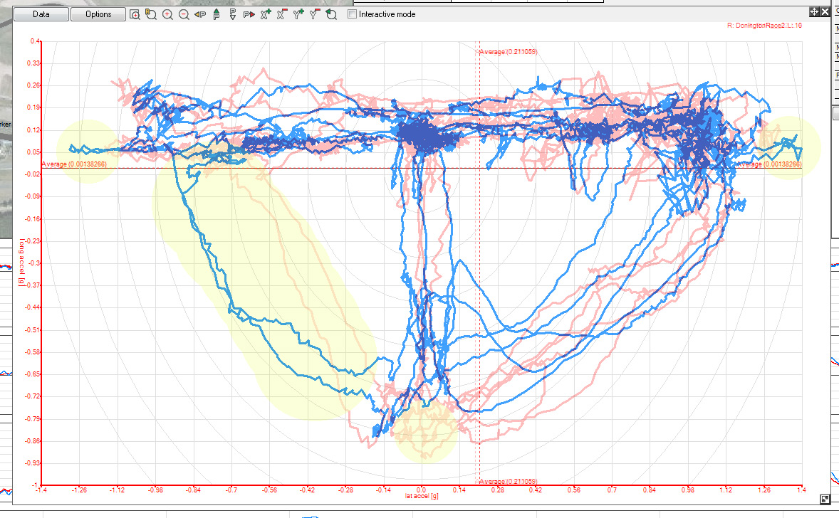
What does this show? Well, I've highlighted the main areas in yellow:
- I'm pulling more maximum lateral g this year, therefore higher cornering speed (top right and top left). Whether that's car setup or balls I'm not sure, but I think / hope it's a bit of both!
- My trail braking / use of the tyres to the left hand side of the circle is muuuuch better (the huge yellow bit). Chuffed with the shape of those two blue lines!
- I wasn't giving it as much beans on the brakes this year (centre bottom). It's pretty damn red from 2013's data, but nothing this year... might be a reason for that too.
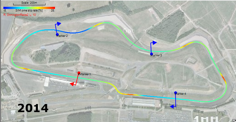
I have also previously mentioned that the software will output the track map in different colours so you can identify exactly where you can make up time. Well, I was borrowing a laptop this weekend just gone and couldn't be bothered to set up a simulation car, I just had a quick look over the data on Sunday afternoon... turns out I should have done as I was losing a lot of time from being a pansy on the brakes!
Here's 2014's data:
And 2013:
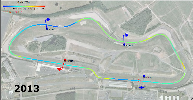
Lots of nasty red (red = slow) at the braking zones in the first picture, gah! However, I was only about 0.1s slower and I think I know the reason...
This is an overlay of my fastest lap in 2013 vs 2014. Again red is last year, blue is this year.
I've highlighted some bits in various colours to make it easier to explain what's going on:
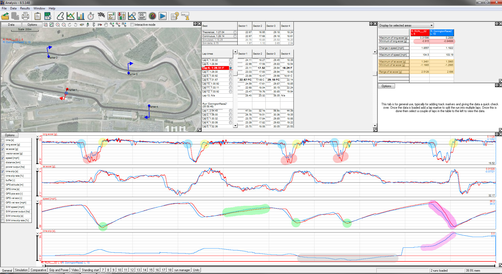
Light blue and red (see top right too): I was braking earlier and not as hard as last year. I think this is a combination of things - I was right behind Amy for the 2014 lap (she brakes pretty early), and I was conscious of wanting to get on the power early so I wanted the car settled early.
Yellow: I was getting on the power early. You can see that the blue trace goes to +ve lateral force earlier in every acceleration zone... which leads to...
Green: A higher apex speed in most places, or getting on the power MUCH earlier (the big long green smudge) and therefore a higher speed up the hill after the old hairpin.
Grey: Which meant at around 2/3rds the way through the lap I was actually ahead of my 2013 best. The 'time slip' is how much one lap has 'slipped' against the other, so when the blue is a positive value it's slipped against the red, and when blue is negative it is ahead of the (flat) red line.
Purple: Again I was having to brake early (actually went on the brakes then nearly off them again if you look at the long accel trace) so lost a lot of time here vs the 2013 lap which you can see by the way there is a big gap between the two speed curves, and the time slip line raises up sharply. Being able to get back on the power early did help get a small amount of that time back though, as you can see from the blue time slip curve heading downwards after I was back on the power.
Orange: These are the maximum lateral loads, quite a lot higher than 2013.
So - what does this show?
Well, I think there has been some improvement (and I'd be suicidal if there hadn't been!). Quite a lot better apex speeds in most places, on the power earlier everywhere, higher lateral g forces and a better 'traction circle'. If I'd have had a clear lap and been able to brake at the normal points I do think I'd have been faster than last year, maybe not a lot but progress is progress
Well done if you read all that!
Basically I'd been looking at my data all through the year and trying to identify where I could go faster. One of my bad habits was turning in too early and therefore having to get really deep on the brakes and being late back on the power. I did a trackday at Anglesey a few weeks and tried to work on this particularly, and I think it was a success, with lap times consistently over a second quicker than when we raced there last year.
However, I'd need to carry that through to the races and other circuits!
Donington 2013 was pretty good for me in some respects - qualified on pole in class and got both fastest laps, but fired it off with alarming regularity (4 or 5 times across the two races I think!), so I was keen not to do that again! I actually wore my brake pads out in race 2, which didn't help, haha, but the data had egged me on to brake later so I blame that
Right - way back I'm pretty sure I chatted about 'driving the circle', which is basically cheating as much grip out of your tyres as possible by trail braking. A more 'rounded' shape to the g force plot means you're getting the most out of the car, basically.
Last year I was reasonably happy with the shape of the plot, but knew there was more to come. The red trace shows last year's fastest lap, and the blue trace is this year's...
What does this show? Well, I've highlighted the main areas in yellow:
- I'm pulling more maximum lateral g this year, therefore higher cornering speed (top right and top left). Whether that's car setup or balls I'm not sure, but I think / hope it's a bit of both!
- My trail braking / use of the tyres to the left hand side of the circle is muuuuch better (the huge yellow bit). Chuffed with the shape of those two blue lines!
- I wasn't giving it as much beans on the brakes this year (centre bottom). It's pretty damn red from 2013's data, but nothing this year... might be a reason for that too.
I have also previously mentioned that the software will output the track map in different colours so you can identify exactly where you can make up time. Well, I was borrowing a laptop this weekend just gone and couldn't be bothered to set up a simulation car, I just had a quick look over the data on Sunday afternoon... turns out I should have done as I was losing a lot of time from being a pansy on the brakes!
Here's 2014's data:
And 2013:
Lots of nasty red (red = slow) at the braking zones in the first picture, gah! However, I was only about 0.1s slower and I think I know the reason...
This is an overlay of my fastest lap in 2013 vs 2014. Again red is last year, blue is this year.
I've highlighted some bits in various colours to make it easier to explain what's going on:
Light blue and red (see top right too): I was braking earlier and not as hard as last year. I think this is a combination of things - I was right behind Amy for the 2014 lap (she brakes pretty early), and I was conscious of wanting to get on the power early so I wanted the car settled early.
Yellow: I was getting on the power early. You can see that the blue trace goes to +ve lateral force earlier in every acceleration zone... which leads to...
Green: A higher apex speed in most places, or getting on the power MUCH earlier (the big long green smudge) and therefore a higher speed up the hill after the old hairpin.
Grey: Which meant at around 2/3rds the way through the lap I was actually ahead of my 2013 best. The 'time slip' is how much one lap has 'slipped' against the other, so when the blue is a positive value it's slipped against the red, and when blue is negative it is ahead of the (flat) red line.
Purple: Again I was having to brake early (actually went on the brakes then nearly off them again if you look at the long accel trace) so lost a lot of time here vs the 2013 lap which you can see by the way there is a big gap between the two speed curves, and the time slip line raises up sharply. Being able to get back on the power early did help get a small amount of that time back though, as you can see from the blue time slip curve heading downwards after I was back on the power.
Orange: These are the maximum lateral loads, quite a lot higher than 2013.
So - what does this show?
Well, I think there has been some improvement (and I'd be suicidal if there hadn't been!). Quite a lot better apex speeds in most places, on the power earlier everywhere, higher lateral g forces and a better 'traction circle'. If I'd have had a clear lap and been able to brake at the normal points I do think I'd have been faster than last year, maybe not a lot but progress is progress
Well done if you read all that!
Indeed it was
I'm watching that tonight then and keep an eye out for you
Mk1 MX-5 (x3), Westy
Great write up again, well done with your results as well.
All the data logging must be doing some good!
Is anymore of the racing televised?
Thanks man. Yeah I do find it helps - quite a lot of work involved in getting the most out of the data, but useful.
We may well be on Motors TV again later in the year at Snetterton, yeah.
I'm watching that tonight then and keep an eye out for you
Sweet - nice one! There's a bit where I fell off the track that they caught
Mk1 MX-5 (x3), Westy
Cos Mk2s are rubbish 
Nah, seriously, I'm not sure... They have Mk2s in Spec Miata but not over here.
Anyway - we were at Anglesey this weekend and had a fantastic time! 2 qualifying sessions, 3 races (1 wet and 2 dry), karting and pizza on the Friday evening, meal out on the Saturday, lots of banter and action throughout the field.
I've combined everything into one video which is pretty long, but the best bits are at Rocket on the first lap of race 1 at 0:50, a very slippery encounter with Matt from 3:58 onwards, race 2 start at 10:13, Rob grass-tracking at 14:34, race 3 start at 17:09, overtaking at 18:37, 19:18 and 20:00, and then a 10 minute position-swapping tussle with Amy from 20:50 til the end of the video, which includes overtakes at 23:23, 25:57, 26:33, 27:34 and 29:10.
If you click this link to go to YouTube then all the times where action happens will be clickable in the video description, or you can watch / scroll through below. Hope you enjoy!
Last edited by a moderator:
Mk1 MX-5 (x3), Westy
Latest update has been a while coming, but here goes...
After Anglesey, things were tight at the top of the standings, so the next race weekend at Cadwell was important. I'd had a really rough month and was really looking forward to getting away from everything and getting stuck in...
However, in the practice session, this happened:
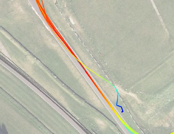
Resulting in this:
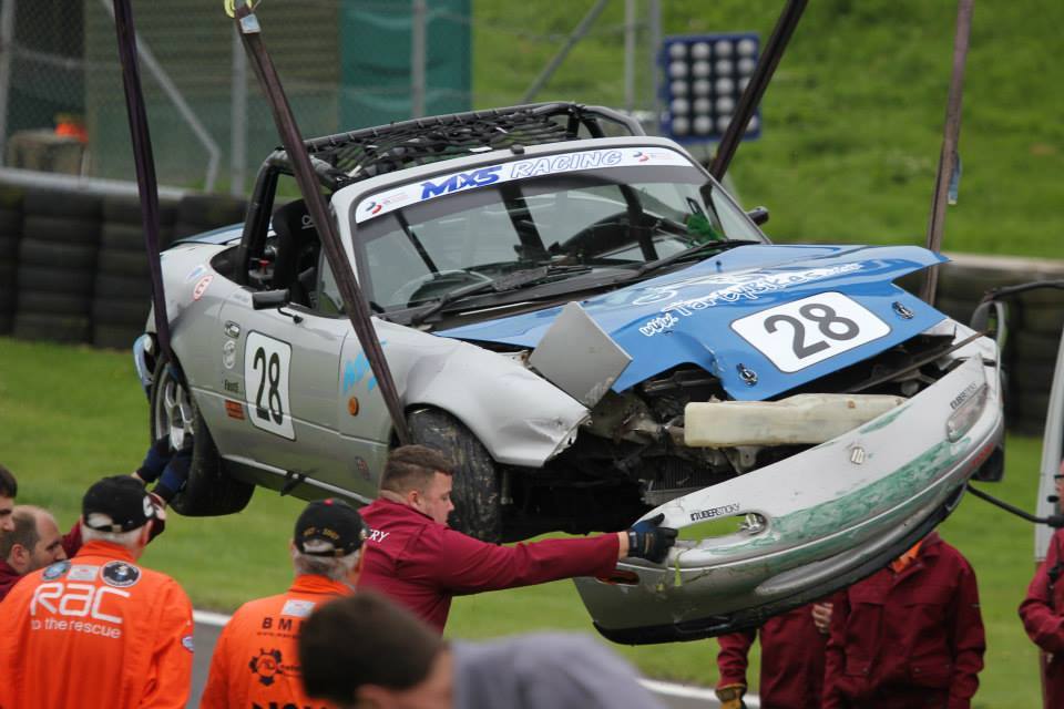
It was completely my fault, just got it wrong through the Gooseneck and got a wheel on the wet grass (dry track). I was totally fine, just bashed my leg on the cage, but the car was a write-off.
So I ended up with this (THANKS Rodders):
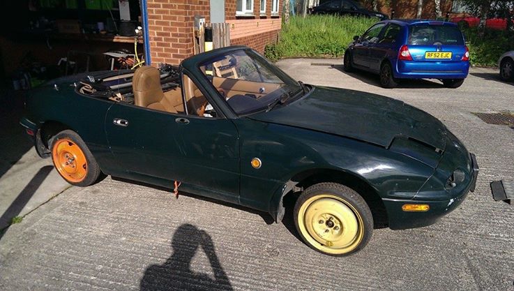
And a month later following many late nights after work it ended up like this:
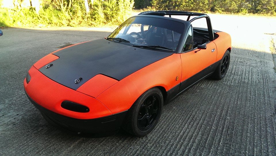
Had a trackday yesterday to shake it down and all was well, apart from spongy brakes which I can't for the life of me work out!
Next up is Brands Hatch at the end of the month - never been to that track before, so looking forward to it...
After Anglesey, things were tight at the top of the standings, so the next race weekend at Cadwell was important. I'd had a really rough month and was really looking forward to getting away from everything and getting stuck in...
However, in the practice session, this happened:
Resulting in this:
It was completely my fault, just got it wrong through the Gooseneck and got a wheel on the wet grass (dry track). I was totally fine, just bashed my leg on the cage, but the car was a write-off.
So I ended up with this (THANKS Rodders):
And a month later following many late nights after work it ended up like this:
Had a trackday yesterday to shake it down and all was well, apart from spongy brakes which I can't for the life of me work out!
Next up is Brands Hatch at the end of the month - never been to that track before, so looking forward to it...
Last edited by a moderator:
Similar threads
- Replies
- 2
- Views
- 467
- Replies
- 15
- Views
- 2K
- Replies
- 4
- Views
- 1K

