ClioSport.net
-
When you purchase through links on our site, we may earn an affiliate commission. Read more here.
You are using an out of date browser. It may not display this or other websites correctly.
You should upgrade or use an alternative browser.
You should upgrade or use an alternative browser.
portrait advice
- Thread starter brynster
- Start date
Focus TDCi
Braver than me, still need to get into taking portraits! 
First one looks best to me, looks like you've used flash.. can't tell? It seems to balance pretty well with the ambient light though (maybe a little bit dark) and no harsh shadows on the face either. Maybe clone out the stick in the background.
Third looks like you missed focus slightly? Her nose seems a bit sharper than her eyes. I'd try and light the wall a bit better/ tone down the flash as well to avoid the shadow on the wall.
#4 and #5 don't work for me, was somebody else taking photos at the same time? The lack of eye contact and the high vantage point make them feel a bit detached if you know what I mean?
Good work though, great base to work from.
Edit: Think you've just added another photo (#2?)
Last edited:
i think the flash look on pic 1 is water reflection, but see what you mean about a little dark maby, yeah never thought of cloneing out the stick gd idea 
yes someone else was in the room talking i think she was looking at them instead of me
and i see what you mean about lighting the wall
thanks for that first reply and already gd advice
yes someone else was in the room talking i think she was looking at them instead of me
and i see what you mean about lighting the wall
thanks for that
no was there all the time lol my pc didnt load one first time i had to refresh and then all 5 came upEdit: Think you've just added another photo (#2?)
Rally bus
no. 1 and 2 distracting backgrounds, clear them or underexpose/use fill-in flash.
no. 3 seems quite a harsh light plus big shadow... diffuse the light source and move the subject away from the wall.
no. 4 and 5 look like snapshots, need composed better eg dogs looking up, legs not cropped etc
I'd try a plainer background for 3, 4 and 5. The one you've used would be ok for shooting a pic of a goth but I don't think it's suitable for kid/family pics, plain white/black looks better in my opinion.
Focus TDCi
brynster said:i think the flash look on pic 1 is water reflection, but see what you mean about a little dark maby, yeah never thought of cloneing out the stick gd idea
Ahh that was my second guess lol, didn't think it was in-built flash as it's coming from bottom left.
brynster said:yes someone else was in the room talking i think she was looking at them instead of me
Aye thought so.
brynster said:and i see what you mean about lighting the wall
thanks for thatfirst reply and already gd advice

Also, if they're a bit further away from the wall it would help reduce the shadow.
no was there all the time lol my pc didnt load one first time i had to refresh and then all 5 came up
Think the same happened to me tbh! #2 is ok, decent skin tone and even light, but not keen on the angle.
Looking at the EXIF I think you're using auto mode? I'd try changing to aperture priority and dialling in around f/4-5.6, blur the background a bit.
1.2 Dynamique billabong
Good effort, the first image is the best, but as mentioned clone out the stick so the boy isnt connected to the background.
I would recommend on getting a different background, a plain colour normally works best.
There are two main styles of portrait photography, high key and low key and they will require different techniques to achieve.
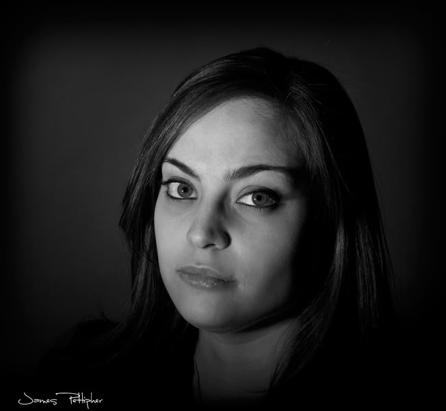
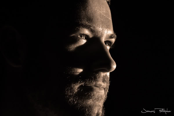
Low key images like these two are normally dark and moody, any light that does fall on the subject is usually not softened with diffusers or softboxes


High key images tend to be much brighter (most tend to have a white background) and usually with softer light.
You can use light to alter the background, as the light falls away it will change from white to grey and eventually black. Therefore by using only a single light on a background instead of two it is possible to create gradients like i have done in this pic

I would recommend on getting a different background, a plain colour normally works best.
There are two main styles of portrait photography, high key and low key and they will require different techniques to achieve.
Low key images like these two are normally dark and moody, any light that does fall on the subject is usually not softened with diffusers or softboxes
High key images tend to be much brighter (most tend to have a white background) and usually with softer light.
You can use light to alter the background, as the light falls away it will change from white to grey and eventually black. Therefore by using only a single light on a background instead of two it is possible to create gradients like i have done in this pic

love the low key picsGood effort, the first image is the best, but as mentioned clone out the stick so the boy isnt connected to the background.
I would recommend on getting a different background, a plain colour normally works best.
There are two main styles of portrait photography, high key and low key and they will require different techniques to achieve.
Low key images like these two are normally dark and moody, any light that does fall on the subject is usually not softened with diffusers or softboxes


High key images tend to be much brighter (most tend to have a white background) and usually with softer light.
You can use light to alter the background, as the light falls away it will change from white to grey and eventually black. Therefore by using only a single light on a background instead of two it is possible to create gradients like i have done in this pic

any advice on which cammera settings for these would be great
Similar threads
- Replies
- 1
- Views
- 517
- Replies
- 8
- Views
- 1K
- Replies
- 43
- Views
- 7K


