ClioSport.net

Register a free account today to become a member!
Once signed in, you'll be able to participate on this site by adding your own topics and posts, as well as connect with other members through your own private inbox!

  • When you purchase through links on our site, we may earn an affiliate commission. Read more here.

Photoshop Guru's - Help... (pic heavy)


First up, sorry if this is in the wrong section, best place I could think of!

Bit of a long shot really but I am looking for some advice and tips on the use of Photoshop to enhance my renders. I work for a kitchen company as a designer, and I draw these images up in ArchiCAD and then render them in Artlantis Render 4. I am reasonably competent with ATLR4 and the renders that come out are not too bad I don't think :eek:

Where I run into problems is when it comes to overall realism, I struggle to get that "photo-realistic" look to them, and I know it's achievable. I think the main key to success is in PS. So my question, is how would you guys make these images look better, could I play with contrast, saturation, brightness, curves ect? Or is there more to it than that? I list all these things, but I'm not too sure how to use them on a render to best effect?!

I have uploaded the high-ish res versions (full res is ridiculous) so people can save them and have a play with them.

I would be very grateful for any help at all really!...
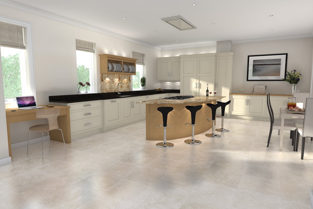
6923361183_c17ccec3aa_b.jpg

Roberts Design 001 V1 by Eddie the Kid, on Flickr
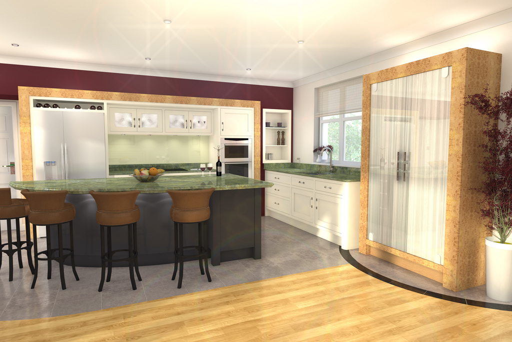
6923361149_ca6f688096_b.jpg

Design 002 V1R1.1 by Eddie the Kid, on Flickr


I know the system can do the kind of quality I am after, I'm just not sure how much of something like this was done in PS:

web_1322746208.jpg
 
I think it's probably more with the original program.

You can't get rid of the glare a bit and tone down some of the brightness but not much more really.
 
Last edited:
  275 Trophy
They look very high-key too me; over exposed you could say. Ask yourself where all that light would be coming from to make the scene that bright? Under the desk in the 1st pic, it's as bright as above it. In reality that wouldn't be the case.
 
I think it's probably more with the original program.

You can't get rid of the glare a bit and tone down some of the brightness but not much more really.

I thought this, but when I asked for advice from some of the guys who use the program they said a lot of work was done in PS :S

They look very high-key too me; over exposed you could say. Ask yourself where all that light would be coming from to make the scene that bright? Under the desk in the 1st pic, it's as bright as above it. In reality that wouldn't be the case.

Yeah I think we have far too much light in the shots. I have tried to find the balance between light and dark, the customer needs to be able to see the final product, if it's too dark they are left wondering and that isn't what we're trying to do. I know what you're saying about the desk though, I'll try to tone down areas like that.

I'm not a fan of the second one at all, unfortunately it's the colours the customer wants, not much I can do about that!

Guess going darker would help a fair bit.
 
I think your props etc don't really help.

I think the table/Mac is okay but then those stools and the floor looks too shiny.

Quick fiddle with the saturation/contrast and taken a bit of the shine out of the floor..

Before..

6923361183_c17ccec3aa_b.jpg


After..

kitchenkid.jpg
 
That certainly is getting there yeah... the stools have chrome bases so sort of need that reflectivity. The floor doesn't though so I guess that might change something.

I am re-rendering a lo-res version of the second one now, with most of the light sources turned off/nearly off so I'll see how that comes out..
 

Knuckles

ClioSport Admin
that last one looks a lot better, i havent used *proper* photoshop in a while but id recommend playing with exposure/contrast/brightness in seperate layers and putting them together
 

Rubicon_

ClioSport Club Member
  Defender 110
How real it looks is all down to the rendering software, and obviously your computers capabilities.
 
How real it looks is all down to the rendering software, and obviously your computers capabilities.

Software is capable, the image above of the child's room was done on the exact same package.

My computer should be more than capable as well, pretty high spec machine.

The failing of the image, is down to me, hence me asking for peoples help! :)
 
Just play with the sliders mate all I did on this 2 minute job is change the Curves (CTRL + M), Colour Balance (CTRL+B) create a duplicate layer set it to Hard Light blending mode and adjust the opacity of that layer to add a tiny bit more depth then select the bottom layer and adjust the brightness and contrast (mainly brightness) to make it look right

Came out with this

shading22copy.png


Its about giving it more depth and changing the colours to more "real world" natural colours. I found making it more blue tinged looks a lot more natural like natural light for some reason.

Nick
 

Knuckles

ClioSport Admin
Even that stumps me, how do you mean, put them together?!?!

sorry, forgot i posted in here... i mean have 3/4 of the same image on different layers, edit the shadows of one, highlights of another, contrast of another then erase the bits that you dont need from each layer/play with the transparency of each layer till youre happy... not sure how much you know about photoshop but thats easy enough to do even if you havent used it before:)
 
No worries,

Remember make the colours look more natural, more vibrant and if it was taken by a SLR Camera or something can't really go wrong.

Need a hand give me a shout :)

You can also use the brush tool (make a new layer) and using either black or white paint over some areas (white for highlights) (black for shading) then adjust the layer transparency and blending options. Make a new layer for each highlight and shade you do so they can all be adjusted to suit individually. You can also use blur and smudge to make a more softer shadow and highlight.

Nick
 
that last one looks a lot better, i havent used *proper* photoshop in a while but id recommend playing with exposure/contrast/brightness in seperate layers and putting them together

Even that stumps me, how do you mean, put them together?!?!

Not sure if I'm stating the obvious, but I think he means do the exposure/contrast/brightness on each individual layer which will all tie in together ontop of your original image.

Obviously never work on your base image (create a duplicate layer of it).
 
Last edited:
Cheers guys, I'm alright with PhotoShop on photos, but I seem to hit a wall with PhotoShop on renders I know the principles are the same but I just can't get that photorealistic look that I know is possible!
 
  Golf gti ed30+bmw m3
Care to elaborate? Even have a go with one of the original shots and show me what you mean :eek:
Can't dude. It's a rendering technique that Generates an image by tracing paths of light through objects and simulates lighting in an ultra realistic way. Renders done well with ray tracing are literally indistinguishable from real life. Needs a lot of processing power though and Usually reserved for very high end rendering software though (thousand of pounds plugin for some).
 
Can't dude. It's a rendering technique that Generates an image by tracing paths of light through objects and simulates lighting in an ultra realistic way. Renders done well with ray tracing are literally indistinguishable from real life. Needs a lot of processing power though and Usually reserved for very high end rendering software though (thousand of pounds plugin for some).

Ah right, nice one mate, cheers.
 
Can't dude. It's a rendering technique that Generates an image by tracing paths of light through objects and simulates lighting in an ultra realistic way. Renders done well with ray tracing are literally indistinguishable from real life. Needs a lot of processing power though and Usually reserved for very high end rendering software though (thousand of pounds plugin for some).

Done some reading on ray tracing, and it would seem I may already be using it, although I dont know for sure. Forgive me if I'm wrong, but is it not the same as radiosity?

In Artlantis, in the radiosity options section, I can change the bounces of light and various settings like colour bleeding and the amount of light carried after the first, second and next bounces, is that what you're talking about?

Really at a loss with this final step, I feel so close to very good renders, yet it seems advice is so hard to come by!
 
  S3, Polo
I'd have said that the look you're after is all down to the settings in the renderer you're using. V-Ray and Mental Ray are capable of that kind of look IME.

If it's just for a still, then it'd be fairly straightforward to achieve that look in post. Process would be: Duplicate the main image layer, Gaussian blurring it by about 4px (depending upon resolution) then adding a layer mode eg 'screen'. Then tweaking the curves/ levels/ h+s to suit...


Top