ClioSport.net

Register a free account today to become a member!
Once signed in, you'll be able to participate on this site by adding your own topics and posts, as well as connect with other members through your own private inbox!

  • When you purchase through links on our site, we may earn an affiliate commission. Read more here.

Have a go: Digital Art


  Oil Burner
Ive stolen this idea from another forum, a chap on this forum posted some images which he has photoshoped into a style like you often see in F1 paintings etc...

Here is one of his, there is another, but i dont want to steal too many of his images, they are on photography-on-the.net if your a member.
digiartfb1.jpg


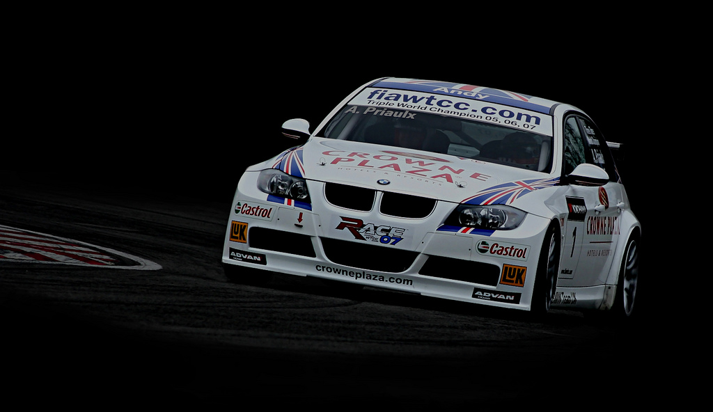
This is one of my efforts with one of my photos:
2287104366_53b68b5695_b.jpg


Any comments regarding my effort gladly accepted, also would be very intrested to see other peoples efforts. Im considering having the above printed on a2 (glad it wont be my ink cartridges) - there have to be some perks to uni.

NICK
 

Clart

ClioSport Club Member
not quite sure what i'm looking at?

surely its just a lasso round the car pasted onto a blank background with some feathering and tweaking of contrast etc?
 
  Oil Burner
not quite sure what i'm looking at?

surely its just a lasso round the car pasted onto a blank background with some feathering and tweaking of contrast etc?

pretty much, what i did was sorta the exact opposite.

I removed the car from the back ground paying v careful attention to how i cut it out.

I then used a black brush to blacken the areas i wanted black, fiddled with shaddows highlights to get the track darker and burnt looking. I then used a 10% opacity brish to merge the black with the track (took quite a while to make it look good) pasted the car in, softened some of the hard edges and things like the back of the rear tire/wing. bobs your uncle. Looks pretty good for only 5 mins work.

I need to get rid fo the tree reflections on mine and maybe some of the light under the car. Then to the printer.
 
  visualize whirled pe
Your attempt actually looks better in composition than the one you've taken inspiration from. I'm sure you already know this but you've used the two thirds principle (or golden section) to better effect then the other bloke.
His F1 car appears to be floating above the track, where-as yours is more solidly grounded.

The only sugestion I would like to give, I hope you dont mind; have a look again at the other guys work, notice the colour values and strength of contrast but also what he has achieved tonally, have a go at boosting the levels on the bmw to get a version with more impact, perhaps even the colour saturation values of the stickers too (although playing with the levels will natuarally increase colour satuaration), dont forget to restore the ballence of the composition by doing the same with the track side markings.
 
  LY 182 FF CUPPED
not quite sure what i'm looking at?

surely its just a lasso round the car pasted onto a blank background with some feathering and tweaking of contrast etc?

just what I was thinking

What I like about the F1 car is the fact he has broken the "golden rule" and used NEGATIVE as a POSITIVE.

The pic leads to a mystery of ..."where and how" the image was created.


Top