ClioSport.net
-
When you purchase through links on our site, we may earn an affiliate commission. Read more here.
You are using an out of date browser. It may not display this or other websites correctly.
You should upgrade or use an alternative browser.
You should upgrade or use an alternative browser.
ClioSport 182
Dont do anything for me sorry.
Na not for me although probably the best colour to try it on!
Christopher
ClioSport Club Member
Z4M
not a fan tbh Dan
the car looks awesome though, as usual
the car looks awesome though, as usual
www.renparts.co.uk
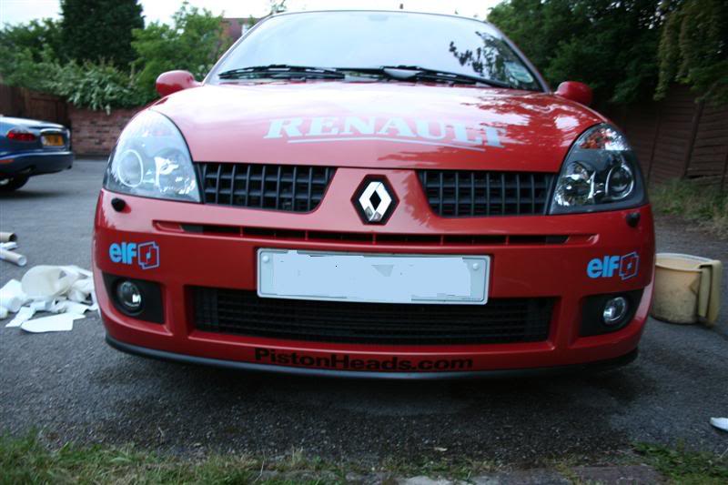
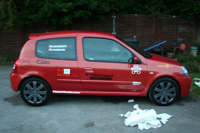
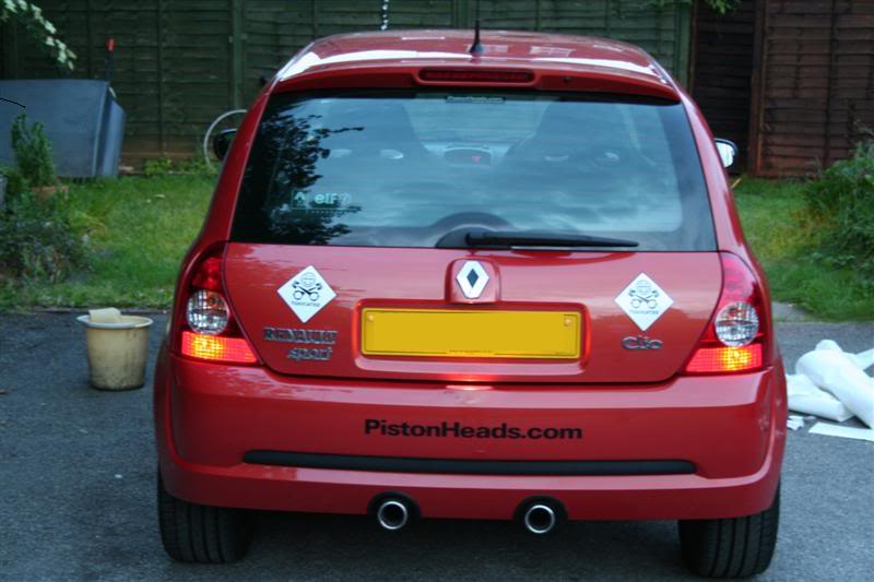
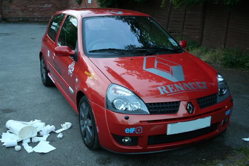
needs to be more... and maybe someone shop them near the rear arch...
Think they will look better on the side skirt near the back wheel....
think thats true having re read the thread
jamie
poet and i didnt know it
carnt belive how high mine used to look
slammage time !
ive got a set of sportline's under the bed... been sat there for 2 months lol
With the renault f1 team sticker, i think that will be better 
182
Christ, if you're going to do stickers do them by full measure and not half.


Ahem...you missed one.
McClickity Click
:rasp:
182
why bump a 6month old topic with two letters
:\
Arse..hadnt realised this was ancient!
len_beach
ClioSport Club Member
E92 M3,172 track car
Probably my fault chaps, I linked it in this thread: http://www.cliosport.net/forum/showthread.php?t=267798
Still, no bother.
Still, no bother.
Opps.
Similar threads
- Replies
- 61
- Views
- 4K
- Replies
- 23
- Views
- 2K

