ClioSport.net
-
When you purchase through links on our site, we may earn an affiliate commission. Read more here.
You are using an out of date browser. It may not display this or other websites correctly.
You should upgrade or use an alternative browser.
You should upgrade or use an alternative browser.
Anyone start a 365 today?
- Thread starter ukaskew
- Start date
Mine for Week 18....
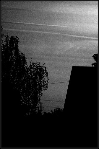
Makes me think of old Horror Films. Just desaturated it, and added noise & grain.
Makes me think of old Horror Films. Just desaturated it, and added noise & grain.
Focus TDCi
thanks, my first attempt at that kind of shot, wish there were some more cars!
Always the way when you're trying to do something.. never goes to plan!
Right here's mine - I'm going for technical over artistic from now on so any comments and tips would be appreciated.
18/52
Focus TDCi
I criticised on flickr
Lol.. indeed!
Erm, I cut off the edge of the TV and the chair to try and give the photo definite edges; I tried leaving the whole TV in but it feels like the picture drops off to the left a bit.. hard to explain! I know what you mean though. I have a habit of not using negative space so might try and include that somehow next week.
It is very cluttered yeah, but I was trying to introduce as many aspects to control as possible.. light, textures, colours etc. so that's why. It won't make explore as it is boring, but I was trying to get the technical side right first.
As for the angle, I dunno.. messed around for a bit with different angles, but eventually settled on that. Probably because I wanted to use my new tripod tbh!
The other photos in my stream are alright, but I don't like how much post processing I've had to use to cover up weaknesses with them.
All a learning curve I suppose. This one isn't perfect either, there are blown highlights, it's not sharp everywhere and probably a bit under-exposed.
Think that about covers it.
Focus TDCi
Fair enough mate. I do think you're being overly critical. Just try and enjoy it. I really try and avoid photoshopping mine. For some of them its unavoidable, depending on what you want to achieve. Mainly its only slight colour tweaks tho..
126..
Yeah, I know what you mean pal.. I try and enjoy it, but it's easier when your photos are good lol.
Good work with the Coke shot, actually makes me want one, which is saying something as I don't really do fizzy drinks!
Mine for this week, it was the contrast between the trees and drax that made me take the picture. Plus the fact it pays for my hobby lol.
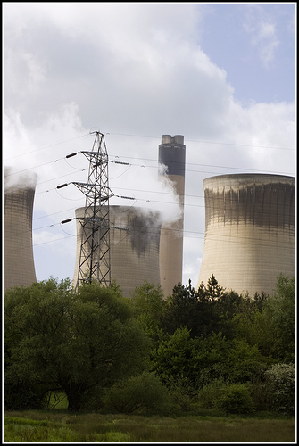
Ta luke.
Cool shot! Suction/mount or handheld?
Leaning out the window handheld.
Read the bit on Flickr LOL.
Fletcher
ClioSport Club Member
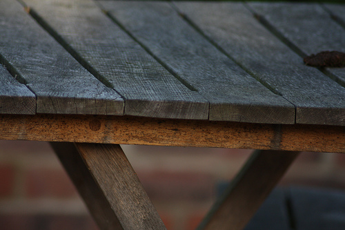
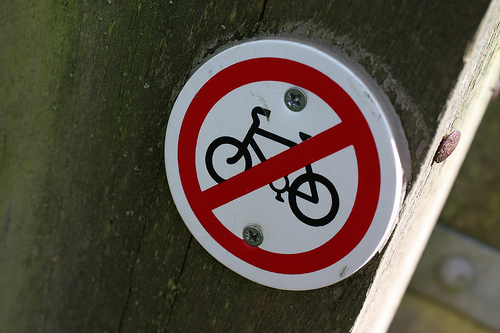
Not put any up for a while, still going though.. here's a few recent pics.
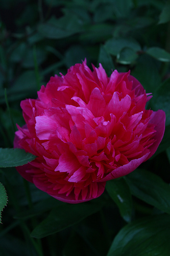
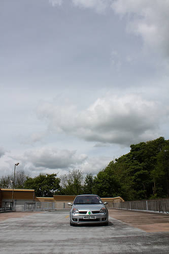
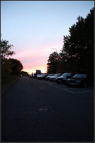
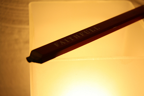
where do you guys get your inspiration from! do you just think at that moment ah be good for a pic?? its all about location isnt it and i was going down through town the otherday and stopped and thought that it would be good for a photo but i couldnt find anywhere to stop!
Fletcher
ClioSport Club Member
where do you guys get your inspiration from! do you just think at that moment ah be good for a pic?? its all about location isnt it and i was going down through town the otherday and stopped and thought that it would be good for a photo but i couldnt find anywhere to stop!
I just take my camera around as much as poss, and take pics of things tbh.
Focus TDCi
Cheers all. 
Lol, had to take it yesterday as today I'm revising. Taken literally ten feet from my back door, whacked it on a wide aperture with just enough background definition to show the alley and aimed at some leaves. Maybe once uni is over I'll make it a bit further.
Anyway, back to revision. Exams a day either side of my birthday.. fun times!
Nice birthday shot Ian
Lol, had to take it yesterday as today I'm revising. Taken literally ten feet from my back door, whacked it on a wide aperture with just enough background definition to show the alley and aimed at some leaves. Maybe once uni is over I'll make it a bit further.
Anyway, back to revision. Exams a day either side of my birthday.. fun times!
Nikon D700
right, i've been a bit lazy with this recently.
I've got no idea how far i got before, but here's some updates, in no particular order:


I've got no idea how far i got before, but here's some updates, in no particular order:
Nikon D700
^ some nice pics there, i like the moon one.
thanks, that was actually the sun, through clouds and with +4 and +2 ND filters on...
Good to see people are still going strong.
My abomination for this week. Not happy at all with it but I really can't be bothered.
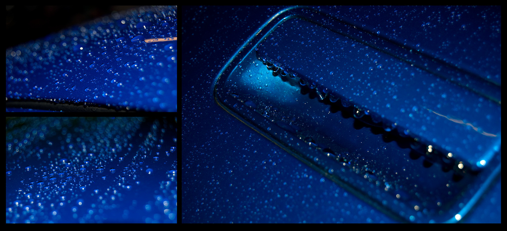
My abomination for this week. Not happy at all with it but I really can't be bothered.
Similar threads
- Replies
- 20
- Views
- 4K
- Replies
- 28
- Views
- 7K
- Replies
- 16
- Views
- 6K
- Replies
- 27
- Views
- 13K

