ClioSport.net
-
When you purchase through links on our site, we may earn an affiliate commission. Read more here.
You are using an out of date browser. It may not display this or other websites correctly.
You should upgrade or use an alternative browser.
You should upgrade or use an alternative browser.
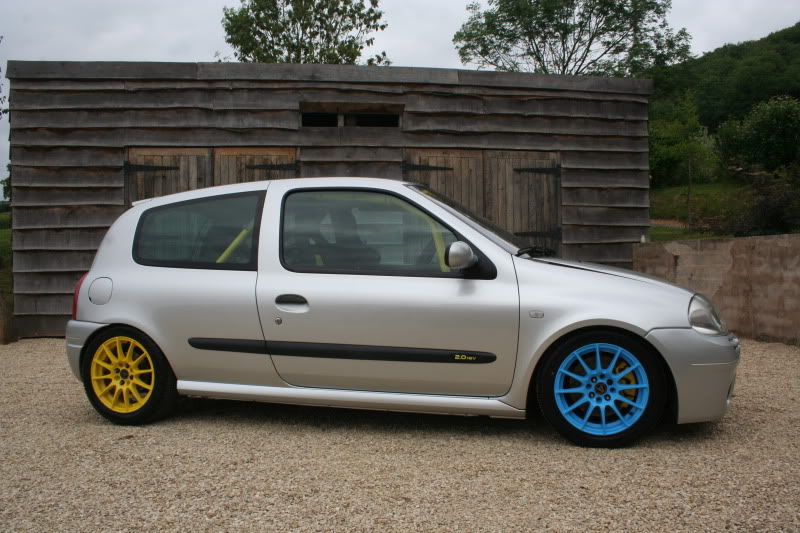
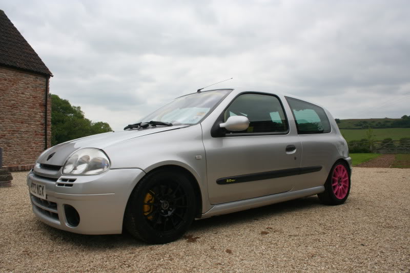
CMYK..(i take your 2 coloured wheels and raise you 2 colours)
Nafoff
ClioSport Club Member
yer i have the wheels in my garage...but i don't have a car to put them on...
...they will be on, photographed and up by the end of the month.
...they will be on, photographed and up by the end of the month.
Christopher
ClioSport Club Member
Z4M
You better check for no 'four colour blacks' in there. 100% K only.

They look ace.
They look ace.
Nafoff
ClioSport Club Member
You better check for no 'four colour blacks' in there. 100% K only.
They look ace.
various blacks are the bain of my life ffs
Christopher
ClioSport Club Member
Z4M
LOL. Same here dude.
Abarth 500
You better check for no 'four colour blacks' in there. 100% K only.
They look ace.
I prefer a 100% with a 30% underpin of Cyan to make the black pop, lol
Christopher
ClioSport Club Member
Z4M
I prefer a 100% with a 30% underpin of Cyan to make the black pop, lol
Only on large areas.
/Geek.
Abarth 500
Only on large areas.
/Geek.
Hero printers do it on smaller areas...
Nafoff
ClioSport Club Member
pmsl.....oh dear
Nafoff
ClioSport Club Member
supreme being t-shirt yeah?
i saw your friend again the other night....we topped 175mph this time....lol
i saw your friend again the other night....we topped 175mph this time....lol
Abarth 500
Completely missed this thread!
I have a t-shirt on today that has "I <3 CMYK" on it... in the blue.
don't you mean Cyan, not blue :rasp:
don't you mean Cyan, not blue :rasp:
I'm dumbing it down for CS, hence the dots.
Haha where was that too phree? Yea it is supremebeing, i actually have it in every colour. How sad.
Pretty sure his gearbox and engine only let him reach 120ish
Nafoff
ClioSport Club Member
same place...peasedown
i think he can drive at any speed his brain will let him imagine tbh
i think he can drive at any speed his brain will let him imagine tbh
Nafoff
ClioSport Club Member
Haha hes not like that, hes actually sound! One of my best mates. He knows vmax is 120ish
hmmmm...look forward to having a play when the 172's back
Nafoff
ClioSport Club Member
here we go...finally on the car


Superb, would have chose green to replace the black wheel though.
Yeah me too. Mint green would look good. The black one kinda looks like the odd one out
Superb, would have chose green to replace the black wheel though.
But then it would no longer be CMYK and I suspect that is the whole point of the scheme.
Nafoff
ClioSport Club Member
But then it would no longer be CMYK and I suspect that is the whole point of the scheme.
you suspect correct...i couldn't be assed to explain...lol
you suspect correct...i couldn't be assed to explain...lol
I just googled CMYK cos I had no idea what the fook it was! I see now why one is black :clown:
Nafoff
ClioSport Club Member
I just googled CMYK cos I had no idea what the fook it was! I see now why one is black :clown:
glad you figured it...
damn that looks awesome. would have put the C with the M on one side if it was me. colors compliment better imo
nah that would have left the black and yellow together...and as the car has black and yellow hints the most of the way round i wanted to mix it up a bit...
leg-end but ppl will just not get it :dapprove:
way to stand out though
way to stand out though
Nafoff
ClioSport Club Member
Rumour has it it's fast, mate said you came beaming past him on PSJ bypass the other day after work. He said he took 1 look and thought fcuk that! LOL.
i was waiting for your mate to talk to you...lol
there was a large gap so i opened here up a bit...when he woke up he gave me a very long close look...lol
Similar threads
- Replies
- 619
- Views
- 106K
- Replies
- 27
- Views
- 13K
- Replies
- 417
- Views
- 65K

